HELLO
1) Please download Class 09 Starter Code
2) Solution to startup-matchmaker included
Class #09
10/15/2018
Flexbox
• Final Projects:
⇒ First deliverable due Monday, October 22nd
⇒ One week away!
⇒ Project proposal/ideas
⇒ Wirefames if possible!
• We start JavaScript next week!
• Flexbox
• Viewport
• In-class Final Project Work
Responsive Review
RWD:
• Designing the optimal viewing experience no matter the device
Static vs. Fluid Layouts:
• Using %-based widths, margins, etc. instead of px-based
Media Queries:
• CSS targeted at specific variables, like screen-size
• When width > 1000px color text red
Within CSS Stylesheet:
	@media screen and (min-width: 1024px) {
	  ...styles here
	}
Media Type: screen
Only target devices with a viewable screen
Rule: (mid-width: 1024px)
Only target windows larger than, or equal to, 1024px
• Multiple rules:
	@media (min-width: 320px) and (max-width: 480px) {
		...
	}

	@media (min-width: 480px) and (max-width: 760px) {
		...
	}
• Set box-sizing: border-box;:
  * {
    box-sizing: border-box;
  }
• Use calc() for help determining exact widths:
  div {
    width: calc(100% / 3)
  }

1. Open the following CodePen
2. Use float's to render the desktop
3. Use media queries to render the mobile
4. Research display: none to hide/show icon
5. Approximate margin and padding values
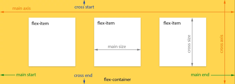
Flexbox
• Page layout can be difficult/annoying/life-ruining
• Flexbox is a CSS tool for easy 2D layouts
• Helps parent element "flex" childrens' sizes
• Parents can vertically/horizontally align children
• Two components: a flex container and its flex children
• The equivalent HTML:
	<div class="container">
	  <div class="child"></div>
	  <div class="child"></div>
	  <div class="child"></div>
	</div>
• <div class="container"> is the flex container
• <div class="child">'s are the flex children
• Easy to use!
• Apply display: flex; to the flex container
• Container's immediate children are flex children
• The flex children will render inline (like floats)
justify-content horiztonally aligns the container's children:
⇒ flex-start (default): items align at the left
⇒ flex-end: items align at the right
⇒ center: items are centered
⇒ space-between: evenly distributed - aligned with conatiner's start/end
⇒ space-around: evenly distributed with equal space around them
align-items vertically aligns the container's children:
⇒ flex-start: items aligned at the top of the container
⇒ flex-end: itemts aligned at the bottom of the container
⇒ center: items are centered
⇒ baseline: aligned along the baseline of their respective text
⇒ stretch (default): items stretch to fill their container
Flexbox Froggy
5 minute break

The Viewport
• Ever had to zoom to move around a mobile website?
• Mobile browsers render webpages in a window wider than the screen
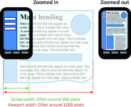
• Esnure content is viewed at the width of the device
• ...not the viewport
<meta name="viewport" content="width=device-width, initial-scale=1">
<meta name="viewport" content="width=device-width, initial-scale=1">
width=device-width
⇒ Controls the size of the viewport; sets it to the device's width
initial-scale=1
⇒ Controls the zoom level
• Open your Startup Matchmaker with mobile dev tools
• Apply the <meta> tag
• Refresh!
• Ensure this tag is included on mobile
Final Project Work

• Relaxr Responsive Capstone
• ...or In-Class Final Project Work