HELLO
Class #08
10/10/2018
Responsive Web Design
• Final Projects:
⇒ First deliverable due Monday, October 22nd
⇒ Two weeks away!
⇒ Project proposal/ideas
⇒ Wirefames if possible!
• Responsive Web Design Overview
• calc
box-sizing: border-box;
box-sizing: border-box;Q: What is the width of the following? (Hint: it's not 100px)
  .box {
    height: 100px;
    width: 100px;
    border: 1px solid black;
    padding: 20px;
  }
A: 142px
100px width +
40px padding +
2px border
box-sizing: border-box;• By default, the width of an element is the sum of:
width (content)
+ padding
+ border
• Initial width increases with padding and border
• box-sizing addresses the confusion
box-sizing: border-box;• Apply box-sizing: border-box; to previous CodePen
  .box {
    height: 100px;
    width: 100px;
    border: 1px solid black;
    padding: 20px;
    box-sizing: border-box;
  }
• Inspect the element's overall width
box-sizing: border-box;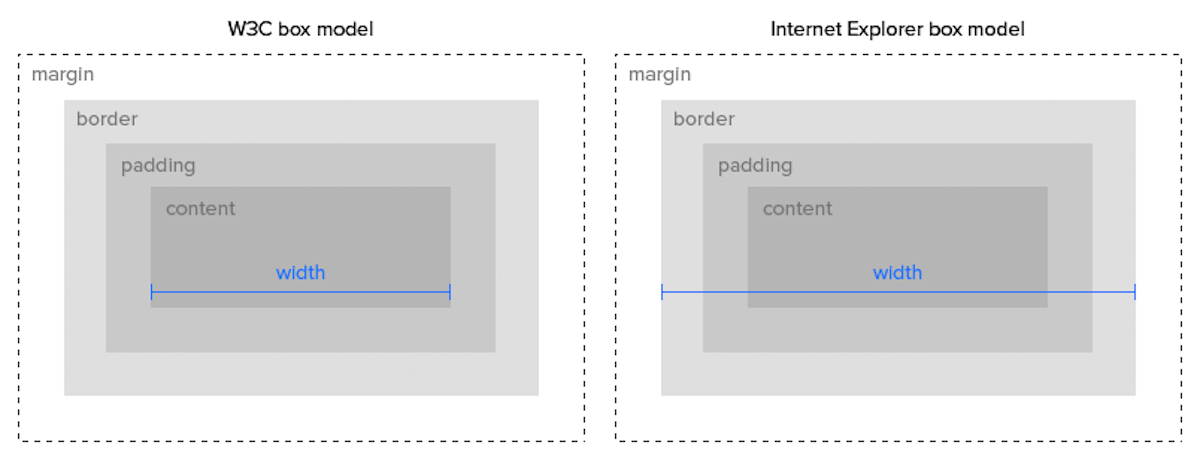
box-sizing: border-box;• Use box-sizing: border-box; for everything
  * {
    box-sizing: border-box;
  }
Let's apply this to Startup Matchmaker!
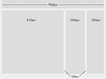
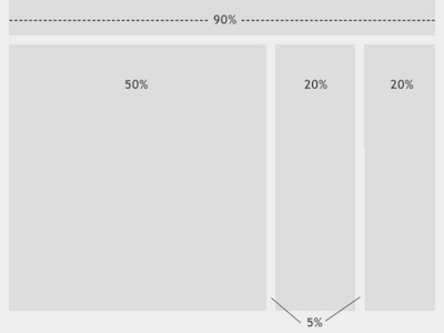
box-sizing: border-box;• Assuming a container width of 960px
• Three boxes of equal width @ 320px
• We also need to add padding: 40px
• We could perform some maths...
• ...or we could use box-sizing!
Responsive Web Design
Definitions:
Allow layout to change as the screen size being used to view that layout changes
Or...
One site for every screen
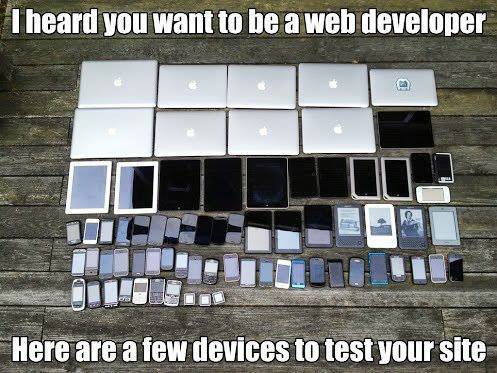
Why is RWD important?
1. Mobile
2. Sheer number of screen sizes
3. One site (codebase) for all screens
4. Improved SEO
Open up...
GeneralAssemb.ly
What makes the site responsive?
GA's Responsive Changes:
1. Element size - height/width
2. Layout (content display)
3. Navbar (icons visible)
4. Elements are hidden/shown
5. Image dimensions
Two pillars of RWD:
1. Fluid layout
2. Media queries
Fluid Layout
• So far, layouts have been fixed (eg 960px)
• Container elements have had a fixed-width
• Content will render the same across screen sizes
• Fluid layouts use relative widths (eg width: 75%)
• Content will adapt to the screen size:
• 75% of 960px ⇒ 720px
• 75% of 375px ⇒ 280px
Startup Matchmaker
Does it have a fluid layout?
• First step towards RWD
• Replace fixed widths with fluid widths
• In Codepen, update .cards-container:
width: 960px ⇒ width: 75%
• What about the widths of .card?
• 100% / 3 (cards) ⇒ ~33%
• We can be precise ⇒ 33.3%
• We can be more precise ⇒ 33.33%
• Can we be even more precise?
calc
calc• calc helps determine sizing (height/width)
• Uses simple arithmetic operators: +, -, etc.
width: calc(1080px/6 - 6px);
• Can mix sizing units:
width: calc(50% - 100px);
calc• For .card, we are calculating 100% / 3
  .card {
    float: left;
    width: calc(100% / 3);
    padding: 40px;
  }
Fluid Layout
Did it solve all our responsive problems?
5 minute break

Media Queries
• Targeted CSS styles based screen size:
  @media screen and (min-width: 900px) {
    body {
      background: blue;
    }
  }
• When width >= 900px style the background blue
1. Within CSS Stylesheet:
  @media screen and (min-width: 1024px) {
    /* Styles go here */
  }
2. Using a <link> tag:
<link rel="stylesheet " media="screen and (min-width: 1024px)" href="css/1024only.css">
Within CSS Stylesheet:
  @media screen and (min-width: 1024px) {
    ...styles here
  }
Media Type: screen
Only target devices with a viewable screen
Rule: (mid-width: 1024px)
Only target windows larger than, or equal to, 1024px
all: Suitable for all devices
handheld: Intended for handheld devices
print: Intended for paged material and for documents viewed on screen in print preview mode
screen: Intended primarily for color computer screens
tv: Intended for television-type devices
- W3.org
width: viewport width
height: viewport height
aspect-ratio: width-to-height aspect ratio of the viewport
orientation: orientation of the viewport
- MDC
• min-width: ___ px
Targets widths greater than or equal to __ px wide
@media screen and (min-width: 1000px) { ... }
• max-width: ___ px
Targets widths less than or equal to __ px wide
@media screen and (max-width: 1000px) { ... }
Don't have to specify a media type:
@media (min-width: 700px) { ... }
Multiple rules:
@media (min-width: 320px) and (max-width: 480px) { ... }
• These styles will only apply on devices between 320 and 480 pixels
Break Points

If you think responsive's simple, I feel bad for you son. We got 99 viewports, but the iPhone's just one.
• There are a lot of break points...
• A few recommendations:
> 1280px
1024px
768px
480px
320px
Codealong
Startup Matchmaker
Let's add some break points!
• Continue work on Startup Matchmaker
• Apply the following RWS techniques as necessary:
⇒ Media Queries
⇒ Fluid Layouts
⇒ box-sizing: border-box;
• Use float: none to stop existing floats

• Responsive Navbar Tutorial
• <meta> Tag
• Startup Matchmaker Responsive Lab